A commentary by the president of King Bros. Ltd.
Having read numerous viewpoints surrounding the installation of the Wharf Street bike lane, and despite my best intentions of steering clear of the controversy, I feel I must, as a long-term Wharf Street business owner, present my experiences and observations.
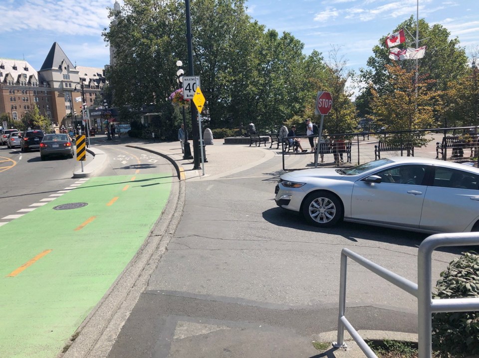
The Wharf Street bike lane is a design failure. I have been a dismayed witness throughout the construction phases, and I am now a daily witness of, and unwilling participant in, the completed chaos.
The new lanes are simply dangerous to everyone. Cyclists, pedestrians and motorists face increased risk of accidents and significant injury under the new layout. The lanes restrict the efficient flow of vehicle traffic, and are responsible for creating a visual abomination on the waterfront.
I was in the southbound lane waiting to turn left at Fort when an ambulance, lights flashing and sirens blaring, arrived behind me. There is no longer space to pull to the right on Wharf, and the northbound driver beside me also had nowhere to go.
The ambulance, along with all the traffic on Wharf, was going nowhere. I made an illegal red-light turn onto Fort to allow the ambulance to pass. One might argue that first responders should not use Wharf, and in a perfect world devoid of accidents, that might be plausible, but reality isn’t so perfect.
It is just a matter of time before someone is seriously injured (or worse), using the new system. Cyclists are crowded into a confined space with no room for escape, and bicycles in opposing lanes can easily have a combined approach speed of more than 60 kilometres an hour. The risk of serious injury in a head-on collision is huge.
Introduce a confused pedestrian into the mix and the risk of a fatal injury becomes a real possibility. I hope the city has ample insurance, because any liability for injury lies squarely with it for the myopic design and installation of this mess.
Adding to the danger, and to the general visual mayhem, is the forest of traffic signs that had to be planted to explain the new system to users and warn of its inherent design flaws.
The other day I counted more than 100 signs, walking north on Wharf from Government, directly related to the bike lane before I got bored and gave up the game.
Not only does the requirement for 100 signs of warning or instruction for a few hundred metres of roadway represent a design failure, it also presents a chaotic and visually distracting streetscape.
Wharf Street has become a jungle of steel posts and signs mostly arranged at eye level. They are an atrocious eyesore on what is arguably one of the most scenic streets downtown, as well as an additional hazard for cyclists and pedestrians to try and avoid.
Out of necessity, I drive to work every day, and every day I need to traverse the bike lane to access my parking stall. As a competent and experienced driver, this procedure terrifies me, because it places both me and cyclists in conflict.
Crossing the flow of traffic is always dangerous, but this is compounded by the diminutive size of the bicycles, the speed they are travelling in both directions, and the addition of a parallel pedestrian crossing.
It is difficult to adequately see that the way is clear, and while I wait for my opportunity to turn, I block traffic in what has become a narrow roadway. The end result is congestion, frustration and danger. This is neither positive nor safe for anyone, and is further proof of a design failure.
While not a daily cyclist myself, I totally support the cycling community, and I have always conscientiously shared the road. The painted white bike lanes around various municipalities are more than adequate to delineate safe space for cyclists and to alert drivers. It is a simple and affordable way of sharing the road that works on most roads most of the time. (By the way, drivers, a solid white line means “do not cross”).
The creation of separated and raised lanes is unnecessary, costly, and ultimately dangerous to users.
The City of Victoria could have saved millions of taxpayer dollars by painting bike lanes following the flow of traffic
Instead, we have constrictive, dysfunctional and dangerous roadways in Pandora, Fort and Wharf, with more to come on Vancouver Street.
As a business owner and employer literally on the front lines of this disaster, I have two suggestions to offer:
To City Hall: Admit that this project represents a design failure, and commit to replacing all two-way separated bike lanes with single-direction painted lanes. Yes, there is expense involved in this, but it will be mitigated by preventing the inevitable personal injury lawsuits, and in the savings realized by not building any more unnecessary separated lanes.
To the citizens of Victoria: Avoid having an accident on Wharf Street, or lower Fort or Pandora for that matter, as first responders will not be able to reach you.


